Page 2 of 4
Posted: Sun Jul 26, 2009 2:53 pm
by archibalduk
Wow these cards are really shaping up very well indeed. I think the McDonald style looks fantastic and will help breathe some new life into EHM.

I completely agree with B72, the team colours do look the best but the nation ones are going to be the best in the long run.
I don't suppose it's possible to modify the EHM skin so that the team colours are displayed where the card would be? Then you could leave a transparent area on the card with the team colours from the skin coming through. If that makes sense...
Posted: Sun Jul 26, 2009 3:31 pm
by Andyjayp
archibalduk wrote:I don't suppose it's possible to modify the EHM skin so that the team colours are displayed where the card would be? Then you could leave a transparent area on the card with the team colours from the skin coming through. If that makes sense...
I understand what you mean. But as iI'm not diverse in the way of skining EHM I couldn't guess at how it could be done or even if it is possable.
Posted: Sun Jul 26, 2009 3:58 pm
by Lidas
awesome!
Posted: Sun Jul 26, 2009 5:36 pm
by grits207
Very nice!

Posted: Sun Jul 26, 2009 6:21 pm
by Asher413
Andyjayp wrote:archibalduk wrote:I don't suppose it's possible to modify the EHM skin so that the team colours are displayed where the card would be? Then you could leave a transparent area on the card with the team colours from the skin coming through. If that makes sense...
I understand what you mean. But as iI'm not diverse in the way of skining EHM I couldn't guess at how it could be done or even if it is possable.
I believe it wouldn't be an edit on the skin, but an edit on the team background picture, assuming transparencies remain on the picture files for the cards.
Posted: Sun Jul 26, 2009 7:43 pm
by CatchUp
Asher413 wrote:Andyjayp wrote:archibalduk wrote:I don't suppose it's possible to modify the EHM skin so that the team colours are displayed where the card would be? Then you could leave a transparent area on the card with the team colours from the skin coming through. If that makes sense...
I understand what you mean. But as iI'm not diverse in the way of skining EHM I couldn't guess at how it could be done or even if it is possable.
I believe it wouldn't be an edit on the skin, but an edit on the team background picture, assuming transparencies remain on the picture files for the cards.
That's an interesting idea. I had been thinking about doing some new NHL backgrounds for this season...
Posted: Sun Jul 26, 2009 8:56 pm
by bruins72
I love the teaser cards! Those really turned out sharp. Now I can't wait to have a whole new set of cards for EHM. They'll go great with the new database.
Posted: Thu Jul 30, 2009 5:53 pm
by Andyjayp
As the AJP-McDonald01 template has edged ahead of the others. I started to do facepacks for the leagues I'm helping Lidas update in his latest DB update.
So
heres the cards for the Ambrì-Piotta Hockey Club in the Swiss NLA. I had some trouble trying to pick decent colours for the nation backgrounds. Hence why they all seem to follow the same colour scheme. Any help on the colour schemes for the nations would be much appreciated. I'm still not sure which team logo's I ahould use, at the moment I decided on using the Ice Hockey Federation logos for the country logo's. But I'm not sure wheather I will stick with this or not.
Anyway... I hope you enjoy them, and any feedback would be much appreciated.
Thanks
Andyjayp
Posted: Thu Jul 30, 2009 5:58 pm
by bruins72
I don't play with that league but those cards sure do look slick!

Posted: Tue Aug 04, 2009 11:46 pm
by Andyjayp
Ok... So its pretty clear what card has one the poll. Unless in the next week everyone votes for the AJP-OPC08 cards.
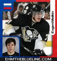
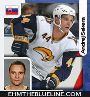
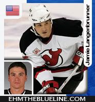
So here is yet another veriation of the AJP09 card (previously AJP-McDonald01).


So which on do people preffer?? The one with the country logo, or the country flag?? I kinda like the one with the country logo (the one on the left).
Thanks
Andyjayp
P.S. For those of you who are waiting for the template it should be released on the weekend, or shortlty after.
Posted: Wed Aug 05, 2009 2:07 am
by watts555
I would say the one with the flag

Posted: Wed Aug 05, 2009 2:53 am
by bruins72
I'm going to say the logo. The flag being in a circle like that makes it look like the Pepsi logo.

Posted: Wed Aug 05, 2009 7:26 am
by Alessandro
I'd go with a normal flag, like this:

Posted: Wed Aug 05, 2009 8:54 am
by McQwak
I agree with Alessandro. The rounded flag looks weird.
Country logos are too complicated and detailed. They don't suite well in overall card design (which is very simple).
Posted: Wed Aug 05, 2009 12:44 pm
by Lidas
I prefer the flag version. I kinda like the rounded flag too...

Posted: Wed Aug 05, 2009 1:23 pm
by A9L3E
I like rounded flag too
Posted: Wed Aug 05, 2009 1:54 pm
by McQwak
C'mon, the rounded flag looks really weird. Can you imagine flags that have significant ornament in the corners? Mayve AJP can show us some more flags. For example USA, Slovak, Greece... The scandinavian countries, Canada and GB will look cool but I doubt other flags can be nice.
Anyway, the overall design is great so this is just a minor thing.
Posted: Wed Aug 05, 2009 7:14 pm
by Andyjayp
McQwak wrote:Anyway, the overall design is great so this is just a minor thing.
Thanks. The piont of doing all this tweaking and minor adjustments is to try and get a card design that everyone likes (Although you can't please everyone).
Ok, so I'm guessing the team colours and flags are the way forward... that only leads to the flags design. I'll get back to the drawing board and post something later on tonight.
Thanks for all the pionters everyone
Andyjap (AJP)
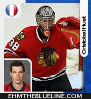
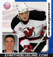
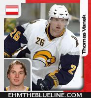
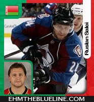
Posted: Wed Aug 05, 2009 9:50 pm
by Andyjayp
Posted: Wed Aug 05, 2009 9:52 pm
by bruins72
I think I prefer the rectangular one better but the circle one doesn't look bad for most of the samples. I think I was just thrown off by the French one looking like the Pepsi logo.

Posted: Wed Aug 05, 2009 9:56 pm
by McQwak
Well, it's perfect!
The classic flag style is better. Just compare the Belarus and USA flags with their rounded variations...
Posted: Wed Aug 05, 2009 11:36 pm
by Lidas
McQwak wrote:Well, it's perfect!
The classic flag style is better. Just compare the Belarus and USA flags with their rounded variations...
You are right. I think they both look good, but the classic flag looks better when there are details out in the corners in the flag.
Posted: Thu Aug 06, 2009 12:33 am
by getzlaf15
I'm with you guys. The Rectangular looks far better in my opinion.
Posted: Thu Aug 06, 2009 1:26 pm
by A9L3E
I think only Belarus rounded flag looks awful.
Posted: Fri Aug 07, 2009 12:00 pm
by Gige
I really like the design with the rectangular flag...Saying that, I would agree with a9l3e that the belarus logo does blend in with the background to much...Is there any way you can keep the left side a constant white like in the USA, France, or Slovakian flags? Other that that...Amazing job