Page 1 of 4
New facepack card design
Posted: Mon Jul 20, 2009 11:53 pm
by Andyjayp
Hopefully I named the thread correctly and people know whats going on.
So as Lidas' new DB is secheduled for release in the fall, I thought I would design some new facepack cards (based on real sets) and start a poll to see which ones, if any you users of TBL would like to see in facepacks of the future.
So the plan is to do facepacks in the TBL style along with the winning style of the poll.
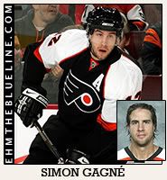
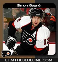
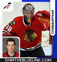
So down to the cards, each one has a dual and single picture...
AJP-Score93
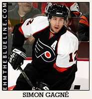 AJP-OPC08
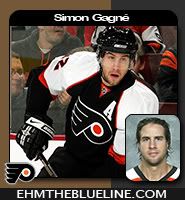
 AJP-McDonald01

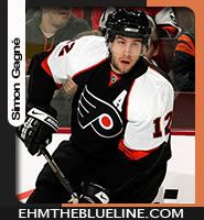
May the best one win
Thanks
Andyjayp
Posted: Tue Jul 21, 2009 12:10 am
by getzlaf15
I went for AJP-OPC08. I'm not a fan of the players name being down the left hand side like in AJP-McDonald01. And i think AJP-Score93. Is plain and simple, just too plain and simple.

Great work on all 3 AJP.

Posted: Tue Jul 21, 2009 2:58 am
by bruins72
I really like the design on the AJP-McDonald01 one. I actually like the name going up the side like that. While I like the way the team colored are used, I know players move around quite a bit. What about using the home nation's colors instead?
Posted: Tue Jul 21, 2009 4:08 am
by watts555
bruins72 wrote:I really like the design on the AJP-McDonald01 one. I actually like the name going up the side like that. While I like the way the team colored are used, I know players move around quite a bit. What about using the home nation's colors instead?
I went with the same one.. I like the idea of the name at the side... the other ones look too plain for me but good job nonetheless
Posted: Tue Jul 21, 2009 5:23 am
by Andyjayp
bruins72 wrote:I really like the design on the AJP-McDonald01 one. I actually like the name going up the side like that. While I like the way the team colored are used, I know players move around quite a bit. What about using the home nation's colors instead?
Hmm... Never really thought of that. That is a good idea. If it is the winning style I think I'll use the country colours rather than using the team colours.
Thanks for the good words everyone. I apprecate it!!
Posted: Tue Jul 21, 2009 1:49 pm
by A9L3E
bruins72 wrote:I really like the design on the AJP-McDonald01 one. I actually like the name going up the side like that. While I like the way the team colored are used, I know players move around quite a bit. What about using the home nation's colors instead?
I'm in your side on this one.

Posted: Tue Jul 21, 2009 2:55 pm
by kuulapaa
I went with AJP-OPC08, it somehow pleased my eye
Maybe it would be even better with some change in the font used in players name?
But anyhoo, they all look good to me!
Posted: Tue Jul 21, 2009 6:05 pm
by Timmi611
I would go with OPC08, because you could have problems in McDonalds with longer player names.
Hey and after we voted could you give me a Template so i can help with the german pictures?

Posted: Tue Jul 21, 2009 7:20 pm
by Andyjayp
Timmi611 wrote:I would go with OPC08, because you could have problems in McDonalds with longer player names.
Hey and after we voted could you give me a Template so i can help with the german pictures?
Sure. If you want it. I'll also write you a detailed guide of how to use it, depending on which template wins.
On the subject of longer player names, you could extend the name bar. Which I had to do when I tested out the original card design with german players.
Posted: Tue Jul 21, 2009 7:28 pm
by watts555
Andyjayp wrote:
Sure. If you want it. I'll also write you a detailed guide of how to use it, depending on which template wins.
On the subject of longer player names, you could extend the name bar. Which I had to do when I tested out the original card design with german players.
Im excited for the template

Posted: Tue Jul 21, 2009 10:30 pm
by Andyjayp
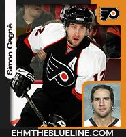
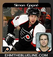
After reading what people have said about the card designs, I have slightly modded the AJP-MacDonald01 and AJP-OPC08 cards. As I think most people like these cards the most.
AJP-McDonald01
Ok so here I thought it would be a cool idea to include the team logo. So one includes the teams logo and team colours, in the case of Simon Gagne it would be the Philadelphia Flyers, whilst the other card shares simular properties but using the players country of origin i.e. Canada.
 AJP-OPC08
With this card, I thought I would just change the font the players name is in.


Thanks
Andyjayp
Posted: Tue Jul 21, 2009 11:36 pm
by watts555
IMO i love the card with the team canada logo on it.. it looks awesome man.. keep up the great work
Posted: Wed Jul 22, 2009 2:34 am
by bruins72
That McDonald card is looking really slick with the logos now. While I still like the team colors, the home country ones are more practical, IMO.
For the OPC08 cards, I definitely don't like the font on the center card. The one on the right is probably best.
Posted: Wed Jul 22, 2009 11:48 am
by getzlaf15
watts555 wrote:IMO i love the card with the team canada logo on it.. it looks awesome man.. keep up the great work
Yeah. I agree that the Nations Flag is the way forward. Most players change team within the first season anyway. So having the team logo is a bit pointless.
Posted: Wed Jul 22, 2009 12:18 pm
by Alessandro
The Canada one is the best
Posted: Sat Jul 25, 2009 3:21 pm
by Timmi611
Awesome work!

with the Team canada logo and the extendable name bar i change my mind and vote for the McDonald one.
Posted: Sat Jul 25, 2009 7:09 pm
by gibson41
AJP-McDonald01 is a real eye candy.
Posted: Sun Jul 26, 2009 12:33 am
by Lidas
If you could make a template for the McDonald cards, I'll update my Swedish Packs using it. (If I ever can get time off from working on the DB...)
Posted: Sun Jul 26, 2009 12:52 am
by CatchUp
McDonald is where it's at. Nice work AJP.
Posted: Sun Jul 26, 2009 1:17 am
by Andyjayp
Lidas wrote:If you could make a template for the McDonald cards, I'll update my Swedish Packs using it. (If I ever can get time off from working on the DB...)
Awesome. I'll release a template once I have cleaned it up a bit, and written a guide of how to use it. Thanks for offering to do Sweeden it would be help that is greatly appreciated.
On the subject of the DB, I should be starting to do the rosters soon.
CatchUp wrote:McDonald is where it's at. Nice work AJP.
Thanks. The words mean alot coming for a graphics guru, such as yourself!!
Posted: Sun Jul 26, 2009 1:31 am
by getzlaf15
Andyjayp wrote:Awesome. I'll release a template once I have cleaned it up a bit, and written a guide of how to use it. Thanks for offering to do Sweeden it would be help that is greatly appreciated.
Can't wait for the Template. I'll tackle the last couple of NHL Entry Drafts.
Posted: Sun Jul 26, 2009 2:24 am
by Andyjayp
getzlaf15 wrote:Can't wait for the Template. I'll tackle the last couple of NHL Entry Drafts.
Thanks dude!! This thing is spraling out of control. I didn't expect so many people to respond.
Anywho thanks everyone for the good words. And tomorrow I'll upload some teaser cards...
Posted: Sun Jul 26, 2009 1:27 pm
by Andyjayp
OK... So here are some AJP-McDonald01 teaser cards.

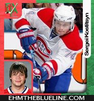

Hope there ok!!
Thanks
Andyjayp
Posted: Sun Jul 26, 2009 1:49 pm
by CeeBee
Sweet
:):)
Posted: Sun Jul 26, 2009 2:28 pm
by getzlaf15
They look great!!!