Page 6 of 8
Posted: Sat Sep 15, 2007 6:23 am
by Saranis
Here's My Ratings of the New Jerseys as well as Logos old or new.
A= Great
B= Abover Average
C= Average
D= Below Average
E= Horrible
F= I want to go blind
Anaheim: C
Atlanta: C
Boston: B
Buffalo: D
Calgary: D
Carolina: B
Chicago: B
Colorado: B
Columbus: A
Dallas: C
Detroit: B
Edmonton: E
Florida: F
L.A.: D
Minnesota: D
Montreal: C
Nashville: D
New Jersey: B
Islanders: D
Rangers: D
Ottawa: D
Philly: F
Phoenix: C
Pittsburgh: D
San Jose: B
St. Louis: B
Tampa Bay: C
Toronto: B
Vancouver: E
Washington: A
Posted: Sat Sep 15, 2007 6:42 am
by batdad
Blackhawks unis are still the best. Always have been, always will be. Montreal, Toronto, Boston, Rangers, Wings are of course--classic too.
Washington is best of any expansion team. And if they keep this color scheme/logo always will be.
Although...I really like Columbus now that the stupid green thing is gone.

Posted: Sat Sep 15, 2007 2:08 pm
by getzlaf15
B. Stinson wrote:Even as one who hates Toronto with an
extreme passion, I have to admit that I think they came out with the best jerseys, after seeing them all in Saranis' link.
As for the rest of the league - with the exception of a few other decent jerseys(like Vancouver, Boston, New Jersey, Rangers' home shirt) - well, I think we've got one ugly league going.

Let's just hope the league doesn't issue an order to cover every jersey in sponsorship for next year.

hmmm... sorry but i have to disagree totally, im lovin all the new jerseys, (well most of), and i think itll add new dimensions in the terms of jersey technology and the colourful schemes used by some of the teams, whereas the jerseys of toronto look pretty boring to me, its always good to see some new things tried by the leagues and the team.
Posted: Sat Sep 15, 2007 5:48 pm
by batdad
Ah.. young getzlaf...the youth of today.... Us crusty guys (sorry Stinson, but you are a bit crusty already) ... HATE CARTOON rubbish and multi, unmatched color unis. They are freaking stupid.
Tradition...is the way to make sure a sport is loved. Changing constantly confuses people and annoys us...Stick to tradition.
Posted: Sat Sep 15, 2007 8:05 pm
by B. Stinson
whereas the jerseys of toronto look pretty boring to me
It's all just preference, I guess, 'cause I'm a huge fan of boring.

The more simple and old-school it is, the more I like it(i.e. Toronto).
...I like to save my psychedelic cartoon side for music appreciation.
And I think this may just be my small bit of O.C.D. speaking, but I also can't stand different home and away jerseys. Stuff like Minnesota has now, where they're both two different designs, and/or using two different logo styles. I somehow cringe any time the two aren't exact reverses of each other. Even small differences like with the Detroit and Columbus jerseys are enough to make me nervous.

Posted: Sat Sep 15, 2007 10:49 pm
by bruins72
LOL! Yeah, that's some O.C.D. for sure. I actually like the new Minnesota jerseys, including that one with the new logo. It's got an old school kind of feel to it even though they're not an old team. I love that.
I really like the new Columbus jerseys too. They've got a decent look out of them now that they've gotten rid of that flying insect with the civil war hat on. I like the whole red, white, and blue color scheme they're going with and the simple logo. Very sharp!
There are so many teams that have UGLY jerseys now and some other where the difference are earth-shattering. Not all of the original 6 teams look good though. There's something off about that Toronto jersey. It needs something. Stripes maybe? It's just... bleh!
Posted: Sun Sep 16, 2007 12:45 am
by B. Stinson
I actually like the new Minnesota jerseys, including that one with the new logo.
Yeah, I do have to give them a lot of credit for that round logo... as well as keeping their traditional logo for the centre of the circle. It looks quite vintage, and then putting their original logo in the centre adds a nice touch of historical importance to it all.

I just have to avoid looking at it alongside their road sweaters and I should safe from triggering any of my mental illnesses.

Posted: Sun Sep 16, 2007 4:14 pm
by getzlaf15
i hate it when the teams use 2 seperate logos for each jersey, its so... impersonal, and it doesnt represent what the teams are, i also dont like it when the teams have 2 totally different jersey designs,

am i the only person that likes most of the new colour schemes? i agree that tradition is a HUGE part of the game, but surely there has to be updates from time to time... doesnt there? it might just be eccentricity talking here, but hey... differences in personalities help us learn more

Posted: Sun Sep 16, 2007 5:26 pm
by B. Stinson
am i the only person that likes most of the new colour schemes?
Colour schemes, or designs? In terms of colours, I think the league is looking very good. Most teams stayed with their normal colours, and the two I can think of who changed, Vancouver and the Caps, went back to their better colours. And I'm quickly beginning to like the dark red and green combo of Minnesota.
Though, in terms of designs... I'm 50/50. Some teams took their lemons and made lemonade, while others tracked down some additional fruit and made a tropical mess(I'm lookin' at you Florida).
Posted: Mon Sep 17, 2007 10:49 pm
by Shadd666
I dislike most of the jerseys. Mainly because of the form-fitting design. Players will look like sweat dancers, which is not exactly my vision of the physical game that hockey is. Other than that, most of the colours and logos are okay. Nothing revolutionnary, no Walt Disney jerseys, the Nucks uni is as ugly as usual, the O-6 stayed in their historical way, the Caps returned to this their old logo which has a far better look... I agree with batdad that the Flyers black is ugly. Orange was better! As for my beloved Flames, i still love the logo, but it really looks naff with those new jersey designs

Posted: Thu Sep 20, 2007 3:18 pm
by crosby87
I think after all the fuss about how tight they are, they look fine in game pics I've seen. It does annoy me that Philadelphia still have black jerseys though, there's too many teams in black/red/blue...
Posted: Thu Sep 20, 2007 3:40 pm
by batdad
Yep..the unis are looking pretty normal to me.
Posted: Thu Sep 20, 2007 5:15 pm
by B. Stinson
I have to agree. Once seeing them in play, they really aren't that bad. ...Still very gimmicky for them to even exist... but they don't look bad.
Third Jersey Curse
Posted: Sat Sep 22, 2007 2:35 am
by Schneides
What gets me is the thinking in Vancouver and Dallas that they need to have the city name on the home jersey, as if the people who go to the games might not know what city they live in!
As a Flames fan I have to say I miss the horse of the apocolypse and also think the flags on the shoulders are horrible.
It is good to see that the third jersey idea seems to be dead. Has anyone else noticed the 'Third Jersey Curse'. I think it was only one of the Stanley Cup Champions since the concept first came in actually had a third jersey!
Cheers
Schneides
Posted: Mon Sep 24, 2007 12:27 am
by batdad
Trust me..the third jersey...will be back, either in 2008-09 or 2009-10. The Canucks are already working on the logo, and have about 5 or 6 extra logos copyrighted already.
Posted: Tue Sep 25, 2007 9:54 pm
by Saranis
batdad wrote:Trust me..the third jersey...will be back, either in 2008-09 or 2009-10. The Canucks are already working on the logo, and have about 5 or 6 extra logos copyrighted already.
Yup, just for this season. Reebok and the NHL agreed that since all teams were changing they were going to wait a year to introduce other Jerseys (this way people will buy these Jerseys, then when they see they like the 3rd more they will buy another Jersey)
Posted: Mon Sep 22, 2008 5:30 pm
by B. Stinson
St. Louis unveiled their third jersey.
I like the simplicity of it as well as the use of the round logo, but the colours are boring. They should have kept the brighter blue. Now they look exactly like the Sabres, minus that yellow blob on the front.
Posted: Mon Sep 22, 2008 5:37 pm
by bruins72
Do you have a link for that Blues third jersey? I can't seem to find a pic of it.
Posted: Mon Sep 22, 2008 7:01 pm
by getzlaf15
I'm really liking Buffalos third jersey that they have just released. Not sure about the Canes though. The blues looks quite smooth too.
Heres the line:
http://blues.nhl.com/team/app/?service= ... eid=382747
Posted: Mon Sep 22, 2008 7:05 pm
by Nurgle
Anyone else miss the old Whaler's jersey?

I really loved it.
Posted: Mon Sep 22, 2008 7:25 pm
by bruins72
I miss giving the guys in the old Whalers jerseys a hard time.

The Whalers had a small, loyal fan base but they really weren't enough to sustain a franchise. I think they had more people in the stands when the Bruins came to town. 2 hours from Boston and you could get great seats for much cheaper than back home.
Posted: Mon Sep 22, 2008 8:20 pm
by Lazion
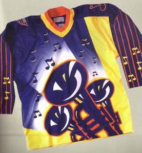
That's much more nicer than this Blues jersey.


Posted: Mon Sep 22, 2008 8:41 pm
by Nurgle
Yeah, I never managed to own one (A whalers Jersey), I just really liked how the jersey looked. Plain... but smart.
Well designed logo!
As far as that Blues jersey... good lord!
I can't really picture a hockey player in that.
Posted: Mon Sep 22, 2008 9:11 pm
by getzlaf15
Lazion wrote:
Haha, Quality!
Was that a serious jersey? It's nearly as bad as...

I can't believe we ever used that in a match!

Posted: Mon Sep 22, 2008 9:35 pm
by bruins72
Lazion wrote:
That's much more nicer than this Blues jersey.


This is the one picture I found when looking for the new Blues third jersey that Stinson mentioned. I take it this was a failed 3rd jersey idea from the past?

