Page 7 of 8
Posted: Mon Sep 22, 2008 9:41 pm
by archibalduk
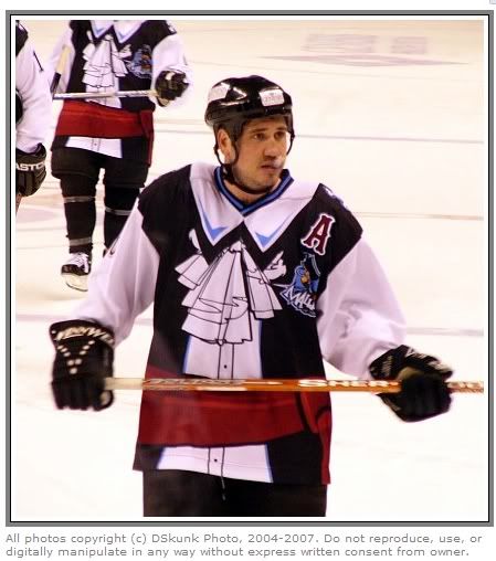
Jeepers, that jersey is horrific.

Perhaps we should run a poll of the most shocking hockey jerseys of all time...

Posted: Mon Sep 22, 2008 9:42 pm
by batdad
At least someone's mock up of one. I think it was 2 years ago that was an idea that was floated as being from the Blues. Not sure if it really was though.
Posted: Mon Sep 22, 2008 9:57 pm
by archibalduk
According to
this blog, the Blues jersey was due for release in Spring 1996 but was vetoed by Mike Keenan.
There's also a pic of the Quad City Mallards' jersey on that blog. I think Minty or somebody pointed that one out once before:

I'd feel thoroughly ashamed to be wearing that one
Posted: Mon Sep 22, 2008 10:23 pm
by getzlaf15
Haha, that is shockingly brilliant. Who is the designer, I thoroughly want to meet them.
And the player on the left looks like Nick Lidstrom!

Whats he doin with the Mallards? (Always wanted to be a Duck).
Perhaps we should run a poll of the most shocking hockey jerseys of all time...
I second that.
Posted: Mon Sep 22, 2008 10:35 pm
by Tasku
Haha! No one's going to take those guys seriously, ever again! That's frekking awful!
Posted: Mon Sep 22, 2008 10:55 pm
by Lazion
Sweet..
Posted: Mon Sep 22, 2008 11:37 pm
by Tasku
If I was a hockey pro I'd get myself a No Stupid Uniforms Clause in my contract, so I could hit the road when they start dressing us up like their own cute little dolls.


Posted: Tue Sep 23, 2008 6:01 am
by Calv
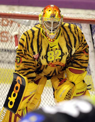
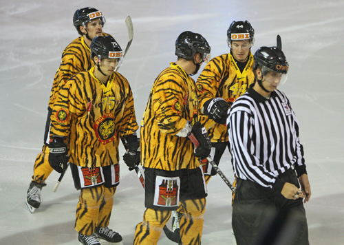
SCL Tigers:
Posted: Tue Sep 23, 2008 6:27 am
by Lazion
That is just awesome!
Am I see right that there is a fur coating?
Posted: Tue Sep 23, 2008 6:40 am
by Lazion

Las Vegas Thunder Valentine's Day edition.

Here is more great AHL jerseys:
http://beanballinc.blogspot.com/2006/09 ... ersey.html
Posted: Tue Sep 23, 2008 1:28 pm
by getzlaf15

These are quality.
Is that Paul Kariyas brother in the SCL tigers uniform?
Posted: Tue Sep 23, 2008 1:47 pm
by bruins72
WOW! I had seen that cowboy sheriff Quad City Mallards' jersey and thought they didn't come any worse than that...
... and then I saw these other ones.

Truly horrifying!
Posted: Tue Sep 23, 2008 2:36 pm
by Lazion
That would be nice to watch games like:
Quad City Sheriffs vs. Quad City Musketeers
Las Vegas Heart Attacks vs. Milwaukee Hippies
SCL Furry Tigers vs. Stanley C. Panther (Florida Panthers mascot)
Posted: Tue Sep 23, 2008 8:10 pm
by archibalduk
Lazion wrote:Las Vegas Thunder Valentine's Day edition.
Hang on a second... Hockey is a real tough guy's sport - what the hell has Valentine's Day got to do with anything?! Pansies!
*  * Not that I'd say that to the LV players' faces!!
Posted: Tue Sep 23, 2008 8:33 pm
by bruins72
Has anyone checked out that link that Lazion provided? WOW!
There are some crazy ones there. And why is it that so many of them came from the Milwaukee Admirals back in the 90's? Was somebody in their promotions department on some serious drugs or something?
Posted: Tue Sep 23, 2008 9:08 pm
by archibalduk
Whoa I just checked out that link.
There's two "halloween" jerseys up there - be sure you check them out. What were they thinking?!
Posted: Tue Sep 23, 2008 9:47 pm
by bruins72
They were probably thinking the same thing they were thinking when they did those Christmas jerseys. I can maybe understand doing Christmas colors, maybe adding a couple little patches too but a whole snowy Christmas village scene? That's a little much!
In baseball the Boston Red Sox have a special uniform they wear for St Patrick's Day (it's during spring training). Basically, it's their jersey but green and a green cap. It looks pretty cool though. I wouldn't mind seeing the Bruins do a variation on their white jersey but done up for St Patrick's Day, do some green stripes instead of the yellow and maybe throw some shamrocks on the shoulders in place of the bear (Bruin) face. Also change the yellow in the spoked B to green. I think that would be kind of cool.
Posted: Thu Oct 09, 2008 4:54 am
by B. Stinson
Thrashers third jerseys came out today.
Not surprisingly, I think of it what I think of most jerseys these days: way too much random "design".
Also, what's with the colour indecisiveness? Didn't they
just change to light blue/dark blue? Now they're going back to the brownish maroon...? I can't keep up.
 http://thrashers.nhl.com/team/app/?serv ... eid=385554
Posted: Thu Oct 09, 2008 7:52 am
by Franck
That Thrashers jersey screams american football to be honest, cut the sleeves off and you have a NFL jersey.
Posted: Thu Oct 09, 2008 10:42 am
by bigargon
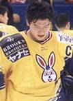
iwho about this uniform for the old Kokuru Bunnies
Posted: Thu Oct 09, 2008 2:21 pm
by getzlaf15
That is a good one Bigargon.
The Thrashers design is quite nice, i don't know why, but i like it...
Posted: Thu Oct 09, 2008 2:22 pm
by Tasku
I don't like numbers on the front.

Posted: Thu Oct 09, 2008 2:34 pm
by getzlaf15
It's like they couldn't think of a logo and thought they would whack some hugely large numbers on the front. Which are also on the back of the jersey. Likeing the colour scheme.
Posted: Thu Oct 09, 2008 2:50 pm
by joehelmer
Yeah, I like the colors too, but they should have used a alternate logo. Like this one or something:
http://cdn.nhl.com/thrashers/images/upl ... er_300.jpg
Just the head that is.
Posted: Thu Oct 09, 2008 4:06 pm
by batdad
Aiyeee....Runs away screaming from the big 17 on the front. Uggh. Ughhh. This is bad bad bad.