Back to topic, I agree with Primis. And for you who complain about the bugs, calm down. I'm sure they'll fix all the bugs. Why on earth whould they leave those bugs there? It's just that we have to be patient. (I know it's not easy for everyone). I bought the Beta myself the day it came out, and was really excited. I started doing logos/facepack and other stuff I could edit/create, then I tried the actual game and it was unplayable... and I have tried it a couple of times with newer versions, but it's still the same game in my eyes (boring/buggy). The game IS nothing I'd like to play right now, so I got back to EHM. I'll be patient and wait until the game starts being "fun", and I'll get "hooked". Right now they've put a lot on work on players (current/historical), and that has probably taken A LOT of time. After all that they might concentrate on all the bugs and UI, who knows... that might not take such a long time to fix/do!?
jhcjobpb wrote:Took me many seconds to see the difference.
You did well! It's been 5 months and the developers still haven't noticed!
jhcjobpb wrote:Right now they've put a lot on work on players (current/historical), and that has probably taken A LOT of time. After all that they might concentrate on all the bugs and UI, who knows... that might not take such a long time to fix/do!?
Actually the developers (who fix the bugs/UI) have nothing to do with the rosters at all
No PRimis I do actually agree with you...it may give you a heart attack. But it is seemingly pathetic that they have not fixed things that are FIRST IMPRESSIOn of the game type issues, or at least done nothing about them.
Alessandro--I hope to god they figure things out because I would love to have an enjoyable hockey game to play.
Archi--Of course I did...I checked that word EVERY SINGLE TIME I WROTE IT. Thought about misspelling it ironically...but wondered if any of you working on the game would actually notice. LOL. Sorry had to.
Nino--Awesome comment on the not noticing the spelling issues.
The first impressions of the game are extremely important...What are the first impresssions? Screen shots...then into the game and the UI and the words themselves. The look and feel of the game. Those first impressions are B.....A......D. This leaves the purchaser or the person checking things out wondering what to do. Do I give the benefit of the doubt? WElll....yes 4 months ago I did. But now....when the first impression is still HORRIBLE..not so much.
Stop spending so much time on the EXTRAS to the game and get the darn basics solved.
Don't you worry batdad, community is here to take care of small things like that. Here, I made game playable just for you.
I'm still pretty neutral about this game. I wasn't excited when I first heard of this project because it's going to take many versions to develop actually good manager game. We'll see how this ends.. I have my doubts, but I wish best of luck for this project.
Lazion wrote:Don't you worry batdad, community is here to take care of small things like that. Here, I made game playable just for you.
I'm still pretty neutral about this game. I wasn't excited when I first heard of this project because it's going to take many versions to develop actually good manager game. We'll see how this ends.. I have my doubts, but I wish best of luck for this project.
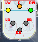
Gah.... those graphs annoy me every time I see them. What a worthless waste of screen space. The number has been enough to convey the information in countless sports games in the past... what does the bar graph provide me? The EHM color coded numbers were pretty much perfect...
Lazion wrote:Don't you worry batdad, community is here to take care of small things like that. Here, I made game playable just for you.
I'm still pretty neutral about this game. I wasn't excited when I first heard of this project because it's going to take many versions to develop actually good manager game. We'll see how this ends.. I have my doubts, but I wish best of luck for this project.
Gah.... those graphs annoy me every time I see them. What a worthless waste of screen space. The number has been enough to convey the information in countless sports games in the past... what does the bar graph provide me? The EHM color coded numbers were pretty much perfect...
I'd think in the beginning at least, when you're overwhelmed with everything, those graphs would help you a bit when comparing your own players. Or signings. And such.
helmespc wrote:Gah.... those graphs annoy me every time I see them. What a worthless waste of screen space. The number has been enough to convey the information in countless sports games in the past... what does the bar graph provide me? The EHM color coded numbers were pretty much perfect...
I'm in this camp as well. Ties back in with my "giving the player as much info at once as possible" and the bars to me are just wasted space when it comes down to it. I wouldn't mind having a sub-screen featuring the bars I guess, but there needs to be a main screen with just the color-coded numbers along with the other player basics. There's just no reason I can't see player physical attributes (height, wieght, age, etc), contract details, game attributes, and current stats all on one screen.
Yeah I completely agree. It's a waste of screen space. Also, the numbers are too small because they've been placed in boxes. Remove the graphs and boxes, make the numbers larger and make them colour-coded - and then put all attributes on the profile screen.
I think the only time graphs might be useful is if there is some sort of compare players screen, similar to EHM's compare player function.
YEP ALL THOSE bars except the POWAH!!! Bar are totally unnecessary. It is part of what contributes to the UI being horrible. Half the rubbish on page 2222 of the team information could be eliminated if OOTP FHM had the powah and strngeht to figure out how to make things simpler. IE eliminating the bar graphs.
The option thing would not work. Eliminate the graphs...put the lineup selection right there. ONE CLICK done. Not click, drag, place, click, click again, save, click again for each and every player. (Note...maybe not that horrible but i have not even bothered) 1st impression.
batdad wrote:YEP ALL THOSE bars except the POWAH!!! Bar are totally unnecessary. It is part of what contributes to the UI being horrible. Half the rubbish on page 2222 of the team information could be eliminated if OOTP FHM had the powah and strngeht to figure out how to make things simpler. IE eliminating the bar graphs.
The option thing would not work. Eliminate the graphs...put the lineup selection right there. ONE CLICK done. Not click, drag, place, click, click again, save, click again for each and every player. (Note...maybe not that horrible but i have not even bothered) 1st impression.
Nope, spot on.... this is why I have it set to make my assistant do all the work
There's some talk in OOTP forums about game design and stuff, so I decided to test things too.
Those rating bars are indeed confusing.
I did some quick and small editing and here's outcome. Colour range for attributes is small and random..
In here I cleared most of the free space:
There's lot of free space to add extra info etc. I personally don't want to see detailed attributes for players in profile screen.. I like more of that overview thing in there, but there's enough of room for all attributes. Also I would love to see roster list in player profie from where you can swich to different players.
The position rating idea I think they could take from Football Manager. Could be one small picture that tells everything where the player can play.
Quick sample I made of a Right winger (Grey unplayable). Natural is green, then the RW rating of 17 could be yellow and center position could be a 14 orange. 10 Red, which is bad. IMO, Pictures almost always better than text/number. And it's easier on the eye.
The upper part is awesome.
The screen is a bit dark, and I don't like the bold font. Also, I like your idea of writing numbers only, but the feeling of wasted space is even bigger with your solution. And Boston is hard to read
Alessandro wrote:The screen is a bit dark, and I don't like the bold font.
Me either.. I just combined EHM style with FHM and with some ESPN.
Too bad that some of data is still stored in .exe file, like attribute and titlepanel fonts. After looking data in there I do think that we are able to add colors for each attribute digit. I didn't test this.. just quessing. For now I just tested changing font size and type.
Wow, it looks awesome That's the kind of personalization I want to see when visiting a team's page. Team colours help feel the team.
If hyperlink colours can be changed (to yellow, for instance), it'd be perfect. I like that the screen is dark, but I agree that there are better fonts out there. I didn't like EHM's either, actually. Bolding the font is not necessary everywhere. The menu buttons would possibly look nice in gold, too.
It'll be difficult to fill the void left by the graphs' removal if it's not possible to add sections with other infos. Might as well leave them, IMO.
Isn't the max attribute be 20? I just looked at the 92-93 databse and saw that Selanne has speed and acceration at 22 and agility 21.
I'm really disapointed at the players current/potential rating in almost all years in the DB. Aleksei Kovalev at 3 star potential in 92? Gotta be kidding me... Who's rating these? And I think Gretzky should be a 5 star rated player, but he was 4,5 in '92 also. And Pavel Bure as one of the best skaters in NHL only has 17 in those speed ratings?!
The maximum attribute is in fact a lot higher. We only really use the 1-20 scale when researching the modern game, but it is useful having the ability to go over the scale in special cases. For example, if you have a particularly aggressive player who amasses huge PIM each season, you can give him an aggression rating above 20 so that he'll get the right number of PIM in game.
Don't worry about the star ratings too much. IIRC they don't work correctly and they will be replaced by a better system which is less precise (in fact I think it is now in this week's public beta).