Want to discuss any hockey related issues? Heard some interesting news? Watched a great game? Heard an interesting rumor or quote? Talk about it here! CONTAINS SPOILERS!
Doesn't look toooooo bad, I would much prefer the very oldschool blue and yellow. But thats better then the silly red and black they've had the last few years.
Yeah I'd heard they were going back to blue and yellow and expected more of an old school look as well... do they know if they are planned to be on blue jerseys?
Will they be ditching the bright red Thirds-turned regualr unis with the crossed sabres?
Minstrel wrote:Yeah I'd heard they were going back to blue and yellow and expected more of an old school look as well... do they know if they are planned to be on blue jerseys?
Will they be ditching the bright red Thirds-turned regualr unis with the crossed sabres?
I really don't know anything about the situation other then whats on that image there. Sorry. It looks like they'll be ditching the red all together though, which I'm happy about.
'A Mix of Old and New
On June 30, an article in The Buffalo News reported that the Sabres are to sport a new logo starting in the 2006-07 season. The new logo, which the paper found posted on internet message boards and authenticated with apparel manufacturers, is a mix of the first and second logos in a form of a charging buffalo. The secondary logo is a modification of the current sabre spiked through the letter "B" with the new color scheme. The team has confirmed that new jerseys will be unveiled in September, but has not confirmed colors or logos.'
The Buffalo Sabres have finally confirmed the so-called 'Buffa-slug' is indeed their new logo for the upcoming 2006/07 season.
GO BUFFA-SLUGS!!!
As for jersey prices it depends on if you get a replica as most people do or the real deal which are the exact jerseys the team gets (for the NHL that also means complete with fighting strap...) and then if you get it as just the jersey or with numbers. Numbers are usually somewhere in the $50-100 range addition and an authentic jersey usually adds around the same bump-up in price. Jersey costs and number/letter customizations depend on the amount of design mainly, they are all different prices.
NHL Shops' Hawks jeresys are Authetics $199 Customizables for $279, Blank Replicas (by CCM not Reebok) are $89 and Customizables are $159.
It will be great to see the old jerseys as 3rds this year too I just don't get the "but were going to darken them for next year" thing... does that mean that they'll still be thirds for 2008 but they will just be darkend from the orginals?
Am I the only one who actually likes the current (or now old) Buffalo Jerseys? I find the old one to be a bit dull. It's not bad though, and I dont mind whichever jersey they'll use.
I don't like that new logo. It looks too flashy, and, well, new. Plus, it doesn't do a very good job at represnting a buffalo.
Whats the price of Ice Hocke jerseys in n.america? My local EIHL team just relased theirs for this season and it costs £50 which is roughly $93.
I got my Philadelphia Flyers/Recchi authentic jersey at Modells several years ago for $123. Then a little bit before Pitkanen started playing for us, I got another authentic jersey customized with his name and number(since no stores had his jersey yet), and that was $70 at a local sporting goods store. Pretty good considering that the Flyers store on the net has jersey's anywhere from $150 to $280.
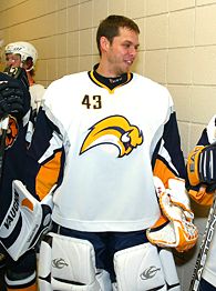
The new Buffalo jerseys took the ice this weekend...
I have to say I now officially hate them. I already thought the banana slug buffalo was silly but now that I see that they also have the player numbers in the mid to upper left? They're a freakin' travesty... I can undestand why the article says they had 20,000 signatures on a petition to reconsider. and I doubt that the pumpkin orange sleeves will ein any supporters especially given the team's proximity to Philadelphia who is known for pumpkin orange on their jerseys:
I don't know what is up with the orage sleeves in that pic though, because the images from the NHL shop seem to have sleeve accents in yellow matching the logo and neck which looks ummm "better" I guess...
As they are just as attractive One a sidenote however, no self respecting female hockey fan would ever wear a pink version of their team's jersey... I can see strippers and "ice girls" wearing them maybe but I think it's just a highly off-the mark marketing attempt. Okay... I gotta start a new thread just about these darn 'fashion jerseys' now You can play along with me if you'd like.
I think everyone is flying off the handle on these unis. Maybe it's just blatant homerism, but I really, really like them. If they didn't have the number on the front, they'd be well nigh perfect. The throwbacks look old next to them, and I did see them next to each other at the unveiling with about 8,000 other people.
I watched the game last night with Buffalo in the dark unis and I have to say I continue to despise them but for new reasons. You can barely see the actual logo when players are playing but what you do see is a ton of yellow and black and to me yellow and black = Pittsburg or Boston (two other teams in their general locale) NOT Buffalo so I just don't understand the decision there to make a black and yellow jersey when you're a stone's throw from two teams that have been black and yellow forever. I wonder how this change makes Buffalo Bills fans feel since Black and Yellow in the National Football League = the Pittsburgh Steelers.
So whatever the change was to be they shouldn't have made a change that causes the team to lose it's identity and infringe upon two other teams that are far more well known for it. It would be different if both of those other teams weren't right in their geographical area too. It was really distracting to me watching them in those jerseys yesterday.


