TBL's Official New Uniforms and Logos thread

Want to discuss any hockey related issues? Heard some interesting news? Watched a great game? Heard an interesting rumor or quote? Talk about it here! CONTAINS SPOILERS!
Post Reply
User avatar
B. Stinson
TBL Admin Team
Posts: 5131
Joined: Mon May 08, 2006 11:22 pm
Favourite Team: Philadelphia Flyers
Location: Telford, PA

TBL's official New Uniforms and Logos thread

Post by B. Stinson »

the game would still be as it is in 1908
That's a bit of an extreme example, but in all honesty, I would be ecstatic if that was the case.

[dream-like state] ...Back in the day when skates were simple leather boots bolted to a metal blade and not designed, tested, and certified by NASA... or when sweaters were actual sweaters... or when the colour white on a sweater was actually a brownish-yellow colour... or when the boards were boards, not billboards... ...and best yet, Gary Bettman was not only not in control of the league - he wasn't even born yet! :joy: [/dream-like state]
User avatar
V4ND3RP00L
Fringe Player
Posts: 384
Joined: Tue Feb 20, 2007 3:45 pm
Custom Rank: JVanderPool
Location: San Antonio, Texas
Contact:

Post by V4ND3RP00L »

I will admit that having those original six teams in the league is great and for them to never honestly change what is so original about them is even better. That is what the NHL is known by basically, those six original teams.

I would love to see the NHL the way it was back in the day, but we all know that it isn't going to happen. It isn't that most people wouldn't want to see it that way, but those in charge sure in the heck don't want it back to that state. I suppose they don't want high ratings or great fans as they once had, but what else is new under the control of Bettman.

All in all, I was always taught that change wasn't a bad thing, but sometimes it wasn't a good thing either. Change has to come at the right time in certain things and right now, change for every single NHL team isn't right.

I feel like if any team should go to using a new set of logos or whatever, then they should set themselves back to what they were in the beginning.

But then again, it is nice to see what people come up with here and there.

By the way, batdad, I understand how you feel about the whole logo thing. They are more worried about how they look on and off the ice. Rather then caring what kind of product they bring to the fans. I would much rather see people out there in horrifying jerseys and honestly playing excellent hockey then having people out there in $2,000 jerseys and not doing anything different then a pee-wee club.

Like I said, I feel that change can be a good and bad thing. But in this case, the NHL needs to not change on account of them not getting anything from it at all.

Is the NHL slightly more popular since the lockout? I don't think so, but does that matter to Bettman? No, it doesn't matter now and it never will to that dumb idiot.

If you want a sport to be popular like it once was, take it back to the same exact state that it was when people loved it.
User avatar
bruins72
TBL Admin Team
Posts: 14513
Joined: Fri Jan 20, 2006 3:13 pm
Custom Rank: Challenge Guy
Favourite Team: Boston Bruins
Location: Taunton, MA

Post by bruins72 »

Joe wrote:I don't like any of those new logo's. I wonder if Detroit will ever get a new logo.
Like batdad said in his rant... some things should never be changed. Detroit has one of those classic, timeless logos. They also share their logo with some of the best boots I've ever worn. Ever heard of Red Wing shoes? They make some of the most durable and comfortable work boots I've ever worn.

Despite the Bruins' Spoked B being so classic, it is actually a replacement logo. Look at the Bruins' new shoulder patch. That's an updated version of their old logo. Over the years they've made slight tweaks to the Spoked B but nothing major. In fact, their new uniforms feature a tweaked version of it.
User avatar
jwh5875
Junior League
Posts: 22
Joined: Sat Jul 14, 2007 3:24 am
Location: Western CT
Contact:

Post by jwh5875 »

There's just some things that shouldn't be completely overhauled...and the Original 6 teams fit that to a T.

I doubt the Wings will ever change beyond the winged wheel (fact on that...the logo was based off of a logo used by an amateur team from Montreal that James Norris played for in his younger days...they just modified the wheel to a car wheel in honor of Detroit being the "Motor City"). I think there'd be a spontaneous riot out in front of the Joe if that happened.

Montreal I doubt would ever change from the traditional CHC and the bleu, blanc, et rouge...matter of fact, I doubt they'd have signed on with the new uniform system if they had to completely overhaul what they've traditionally worn.

Same goes for the Hawks too...the Indian head is just iconic and I don't see that getting removed/seriously changed around

Rangers too...I think the "Lady Lib" logo is going to get retired and they'll just keep it with what we expect..."RANGERS" down the front diagonally.

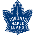
The Leafs? I'd be much happier if they brought back the classic, more realistic looking leaf from the 50s & 60s rather than the current one...heck, it might mean they might actually get back to the Finals ;) (but, on second thought..it IS the Leafs we're talking about (no offense meant to any Leaf fan in the house..all in jest)..)

As for the Bruins...I got a good look at their new threads and the new logos...as a traditionalist, I love them. Love the updated Hub logo and I thought bringing back the very-old school bear was a classic touch. As for the new unis? They're probably the sharpest set I've seen so far.
User avatar
batdad
The Great One
Posts: 12616
Joined: Thu Aug 17, 2006 7:46 pm
Custom Rank: Mr Technology
Favourite Team: Syracuse Bulldogs.
Location: Look behind you, you peon

Post by batdad »

No doubt JWH...and just as long as we never see the Captain Highlander fishstick unis I will be happy. Those things....are as bad...as the Canucks have ever had!
User avatar
jwh5875
Junior League
Posts: 22
Joined: Sat Jul 14, 2007 3:24 am
Location: Western CT
Contact:

Post by jwh5875 »

batdad wrote:No doubt JWH...and just as long as we never see the Captain Highlander fishstick unis I will be happy. Those things....are as bad...as the Canucks have ever had!
You and me both!

Ugh...I hated those jerseys...

The saddest thing I ever saw was seeing a guy wandering around at a Bridgeport game shortly after they came into the AHL (2001-02 season) wearing a Fisherman jersey...done up as a Denis Potvin jersey. ](*,)

I was torn between wanting to throw up or cry....
User avatar
batdad
The Great One
Posts: 12616
Joined: Thu Aug 17, 2006 7:46 pm
Custom Rank: Mr Technology
Favourite Team: Syracuse Bulldogs.
Location: Look behind you, you peon

Post by batdad »

Getzlaf15 said:
Nashville have unveiled a new jersey, i like the dark one but the white one is boring, what's everyone else think about this?

take a look :Nashvilles New Jersey

Systemfel said:
That away jersey is just awful. You will barely be able to spot it on the ice.
Bruins72 said:
Wow! Those look pretty craptastic!

I guess all NHL teams can achieve the classic coolness of the Bruins' new jersey.
User avatar
B. Stinson
TBL Admin Team
Posts: 5131
Joined: Mon May 08, 2006 11:22 pm
Favourite Team: Philadelphia Flyers
Location: Telford, PA

Post by B. Stinson »

I can't say I'm a supporter of those Nashville sweaters. There's way too much "design" for me. :dunno:
User avatar
bruins72
TBL Admin Team
Posts: 14513
Joined: Fri Jan 20, 2006 3:13 pm
Custom Rank: Challenge Guy
Favourite Team: Boston Bruins
Location: Taunton, MA

Post by bruins72 »

"Design" is exactly the right term! I just don't get the way the sleeves work. The white and the silver (or is it grey?) are just too similar. and the way the blue looks on that picture where Suter is waiving... it just looks like a triangle. The other (away) jersey is even worse. It looks like it's all white... again because of the white and silver being too similar.

I can barely match my socks in the morning and I could probably design better jerseys than what these teams are coming up with!
User avatar
jwh5875
Junior League
Posts: 22
Joined: Sat Jul 14, 2007 3:24 am
Location: Western CT
Contact:

Post by jwh5875 »

All I have to say about those new Nashville jerseys...

Swing and a miss, Preds.

I had a feeling some teams would get in touch with their inner ugly with the new unis...we have our first winner though.
User avatar
batdad
The Great One
Posts: 12616
Joined: Thu Aug 17, 2006 7:46 pm
Custom Rank: Mr Technology
Favourite Team: Syracuse Bulldogs.
Location: Look behind you, you peon

Post by batdad »

Come on jwh5875..you are happy that the Preds are the first ugly one, because you were just as scared as I am about the Canucks...that the Isles uni's might smell rather fishy... :-D
User avatar
B. Stinson
TBL Admin Team
Posts: 5131
Joined: Mon May 08, 2006 11:22 pm
Favourite Team: Philadelphia Flyers
Location: Telford, PA

Post by B. Stinson »

By the way, what's the deal with all these new logos and uniforms coming out? Are teams just coincidentally modernizing with the new jersey style, or is this a lame league/team ploy to make a little extra cash?
User avatar
batdad
The Great One
Posts: 12616
Joined: Thu Aug 17, 2006 7:46 pm
Custom Rank: Mr Technology
Favourite Team: Syracuse Bulldogs.
Location: Look behind you, you peon

Post by batdad »

A little of both. The NHL says 2 unis only next year, home and road. With the new tight style...the old uni's won't look so good, and many have been concerned that things like horizontal stripes won't look so good any more.

However..tis also a cash grab...as always.
User avatar
bruins72
TBL Admin Team
Posts: 14513
Joined: Fri Jan 20, 2006 3:13 pm
Custom Rank: Challenge Guy
Favourite Team: Boston Bruins
Location: Taunton, MA

Post by bruins72 »

Yeah, most teams are planning on just a slight change to go with the new high tech jerseys. Some teams are just going a bit further. To be honest, overall I thought they were going to be a lot worse. Instead, it looks like only one or two teams have really missed the mark. So far I'm most impressed with the first two that I saw, the Bruins and the Capitals.
User avatar
batdad
The Great One
Posts: 12616
Joined: Thu Aug 17, 2006 7:46 pm
Custom Rank: Mr Technology
Favourite Team: Syracuse Bulldogs.
Location: Look behind you, you peon

Post by batdad »

I really like the Caps unis. May have to buy a Chris Clark one. I was a big caps uni fan back as a kid...even though they sucked so bad. My buddy and I used to pretend we were Ron Low, and let the other guy score on us a thousand times. Then he went to the WHA and the Oilers...and wouldn't you know it...he got better...or at least the Oilers could score alot and made him look better.


On topic: Boston, cool. Washington Awesome. Tampa average. San Jose...meh.

Nashville/Hamilton/Kansas City---ICKY
User avatar
jwh5875
Junior League
Posts: 22
Joined: Sat Jul 14, 2007 3:24 am
Location: Western CT
Contact:

Post by jwh5875 »

batdad wrote:Come on jwh5875..you are happy that the Preds are the first ugly one, because you were just as scared as I am about the Canucks...that the Isles uni's might smell rather fishy... :-D
It won't be the last....I have "faith" that both the Isles and Nucks will out-ugly everyone :-D
User avatar
bruins72
TBL Admin Team
Posts: 14513
Joined: Fri Jan 20, 2006 3:13 pm
Custom Rank: Challenge Guy
Favourite Team: Boston Bruins
Location: Taunton, MA

Post by bruins72 »

Maybe the Nucks with bring back the old classic black/orange/red/yellow and every other color stripe look? :-D Have the Canucks ever had a good looking jersey?

I think the Islanders are best sticking to their old classic stuff. The Gorton's Fisherman thing was just terrible. I hope they don't decide to go with a roided out version of him on the new jerseys!
User avatar
batdad
The Great One
Posts: 12616
Joined: Thu Aug 17, 2006 7:46 pm
Custom Rank: Mr Technology
Favourite Team: Syracuse Bulldogs.
Location: Look behind you, you peon

Post by batdad »

Yes they have...the stick in the rink ain't the best logo, but the blue/green are cool unis. I even really like the whites in that color scheme.


I want the Isles to go with the bright orange home uni, with the fishstick guy on ROIDS...yes!!! So cool...
User avatar
bruins72
TBL Admin Team
Posts: 14513
Joined: Fri Jan 20, 2006 3:13 pm
Custom Rank: Challenge Guy
Favourite Team: Boston Bruins
Location: Taunton, MA

Post by bruins72 »

That would officially be the worst professional sports uniform EVER! I don't know if you follow the NFL but do you remember the old Tampa Bay Buccaneers uniforms that were white and orange? UGGGH!
User avatar
batdad
The Great One
Posts: 12616
Joined: Thu Aug 17, 2006 7:46 pm
Custom Rank: Mr Technology
Favourite Team: Syracuse Bulldogs.
Location: Look behind you, you peon

Post by batdad »

Yep...A former BC Lion (CFL) ...harry holt I think went and played for the Bucs. Kind of funny, cause at the time BC had orange unis too. And we kind of like them here.

Anyway, Nashville is very ugly. Lets hope the others come up with better than that.
User avatar
crosby87
Drafted
Posts: 199
Joined: Thu Jan 18, 2007 8:58 pm
Location: Albany, NY

Post by crosby87 »

Any point in Nashville coming out with new ones? They'll be changed again when the team moves next year :**
User avatar
bruins72
TBL Admin Team
Posts: 14513
Joined: Fri Jan 20, 2006 3:13 pm
Custom Rank: Challenge Guy
Favourite Team: Boston Bruins
Location: Taunton, MA

Post by bruins72 »

Well... they have to keep up appearances. :dunno: They don't want to tell the fans they're done with them. If they did that, they wouldn't show up this season.
User avatar
getzlaf15
Hall of Fame
Posts: 1932
Joined: Sun Jan 28, 2007 9:33 pm
Custom Rank: TBL Update Team

Post by getzlaf15 »

crosby87 wrote:Any point in Nashville coming out with new ones? They'll be changed again when the team moves next year
Is there any chance that the Preds will stay?

If not... The fans won't be tempted to watch the games just because of a new jersey, they need a LOT more than that, such as reassurance that the team won't leave
User avatar
B. Stinson
TBL Admin Team
Posts: 5131
Joined: Mon May 08, 2006 11:22 pm
Favourite Team: Philadelphia Flyers
Location: Telford, PA

Post by B. Stinson »

If they did that, they wouldn't show up this season.
Would that be much of a change in pace for them? :-D
User avatar
getzlaf15
Hall of Fame
Posts: 1932
Joined: Sun Jan 28, 2007 9:33 pm
Custom Rank: TBL Update Team

Post by getzlaf15 »

haha, very true,

with the team they have this season, i will be surprised if anyone will watch them, loss of kariya, forsberg, timonen, vokoun, and only john blum as there top prospect, not the best of futures either
Post Reply